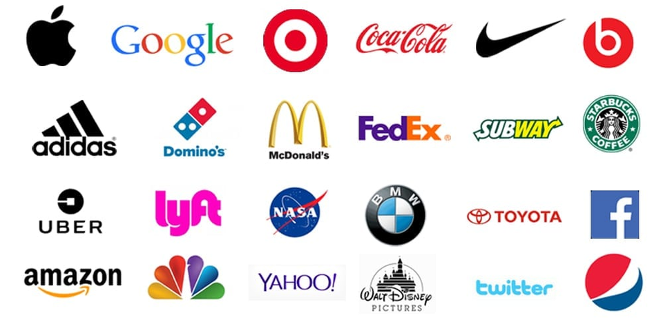
Your logo helps your company to establish it’s branding. That is why it is important to ensure you have a designer the will produce something you will be satisfied with. Sure you could go to one of those sites and have a logo designed for $5, but as the saying goes, you get what you pay for. Although, according to what I have found on the internet, so it has to be true, the designer that created the NIKE logo only got paid $35. Given that was in the 70’s and she was a student at the time. They didn’t even like the design at first. Now, almost 50 years later, it is one of the most recognizable logos in the world. Sure it is NIKE and they were probably going to be big no matter what. The logo could have consisted of 3 dots in a row and that would have been on all of the shoes, athletic gear, commercials and shaved into the back of kids heads, and everything would have been exactly the same. Of course the logo has undergone revisions and updates. You have to keep up with the times, but the basic foundation remained the same.

It is the same thing for the Apple Logo. Another icon that is well known. However, the Apple logo began as something completely different. And evolved into what we see today. Yet another great example of company branding. Designing a logo isn’t as easy as some think. Sure, some have most likely been happy accidents. Sometimes less is more. However, for the majority a lot of thought has gone into it. There are a lot of key components to take into consideration in the creation process.

LOGO STYLES
Before sitting down with a pen and paper, you first must figure out what style of logo your client requires. There is nothing worse than whipping up a bunch of mock ups for a client and them feeling like the point was missed and having to scrap them all and begin from square one. It is best to have a design brief with multiple questions trying to hone in on the kind of logo they desire. These are a few different kind of styles that can help you to narrow it down.

Wordmark
A wordmark is a kind of logo used when a company has a unique name. When the name of the company is the focus and can stand alone through use of some stylistic font and color usage. Logos such as Google, Subway, Fedex, Fender, Ray-Ban, Jeep, etc. are all examples of wordmark logos. Look at any movie cover and just about all of the titles are done in wordmark logos. A well designed wordmark logo can be very effective.
Icon
An Icon logo is just that, it’s an icon that is strong enough to stand alone. We spoke about NIKE and Apple earlier, these are prime examples for proper use of icon logos. Most logos require some sort of icon that can be used to stand alone simple because it is nice to throw it on the bottom of a letterhead, business card or used for an app icon. They are also perfect for favicons which are the logos that are displayed on the address bar to the left of your URL.
Combination
A combination logo is one that uses both the icon and the wordmark. This is the most popular style of logo there is. Many because you can have the best of both worlds. On your business card or website you can have the full logo, but on the phone or letterhead you can just have the icon. Basically any sports team is a perfect example of these. They have such strong wordmark and icons, and are just well known, that either can stand alone.
Emblem
Emblem logos are common among universities. They are designed to obtain a more prestigious feel. Something that looks good on a shirt or on branded notebooks to walk around campus and let people know you go to that school. When I think emblem logos, I think family crests. Something that has a lot of history and meaning all shoved into a little 3.5″ x 2″ logo. Not usually popular with the modern style of logo design, however if done right, can produce a very nice logo and brand.
Color Theory

Most of you have heard of the color wheel. regardless of being a designer or artist, or neither. It breaks down into 3 basic categories. There are Primary colors, secondary colors and tertiary colors on the color wheel. Your primary colors are your basic red yellow and blue. These are the main colors to use and when mixed, they make the secondary colors. The secondary colors are green, orange and purple. Then you mix those colors with your primary colors to make all of the other colors. The colors opposite on the color wheel are the complimentary colors. I have never known why they have been called that. Personally I strive to avoid the usage of complimentary colors. Place a red font on top of a blue background. It is so vibrant it hurts to stare at and read. However, all of these colors can create what is called a color harmony when used properly. Finding a set of colors that work well together. Certain colors inflict certain emotions in people. I am sure that you have noticed that a lot of fast food companies mostly use reds and yellows. There is a reason for this. Color Theory plays a large role. Much like the reason that you don’t paint a newborns room a bright red or yellow. It will be irritating to them. Unless you enjoy dealing with a constantly crying baby, you might want to use a more calming color such as blue. A lot of spas will use more muted colors to give you a sense of relaxation.
Start Designing

So before you go wasting a bunch of your time and your clients time, make sure to find out as much information as possible before presenting them with the logo mock ups that you have worked so hard to design. Start by doing some research if you are unfamiliar with the type of company you are designing for. Perhaps present them with some different color schemes and example logos to get a feel for what they want. Then start drawing up some comps. It is always good to begin with some sketches and doodles to ensure that you are on the right track. It is always better when you can sketch some decent ideas before going straight to the computer. I have had professors telling me not to let the computer do the work for me, but since I work in such a high paced environment, I don’t have time to sketch everything out. So, sometimes it is just quicker to start designing something with skipping the sketching process. However, designing is never that simple. It is generally based off of a case by case basis with different clients. Some clients you will find are easy to work with and love everything you design. Other clients on the other hand, are quite the opposite. And some have no idea what they want, in which case you have to show them. There are millions of logos out there. Sometimes creating something unique isn’t as simple as it sounds. Just follow these rules, keep up with the trends and listen to your client one can design something great. If the client is happy . . . everyone is happy.
